 Buy now
Shop components
Components that are related to the e-commerce section of the website.
Product card: Basic example
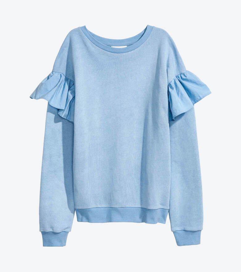
Shirt with insertion lace trims
<!-- Product card: Basic example -->
<div class="card card-product">
  <div class="card-product-img">
    <a class="card-img-top" href="#">
      <img src="path-to-image" alt="Product image">
    </a>
    <div class="card-product-widgets-top">
      <span class="badge product-badge badge-danger">-50%</span>
      <div class="star-rating ml-auto">
        <i class="sr-star cxi-star-filled active"></i>
        <i class="sr-star cxi-star-filled active"></i>
        <i class="sr-star cxi-star-filled active"></i>
        <i class="sr-star cxi-star-filled active"></i>
        <i class="sr-star cxi-star"></i>
      </div>
    </div>
    <div class="card-product-widgets-bottom">
      <a class="btn-wishlist ml-auto" href="#" data-toggle="tooltip" data-placement="left" title="Add to wishlist"></a>
    </div>
  </div>
  <div class="card-body pb-2">
    <h3 class="card-product-title text-truncate mb-2">
      <a class="nav-link" href="#">Shirt with insertion lace trims</a>
    </h3>
    <div class="d-flex align-items-center">
      <span class="h5 d-inline-block mb-0 text-danger">$20.40</span>
      <del class="d-inline-block ml-2 pl-1 text-muted">$40.80</del>
    </div>
  </div>
  <div class="card-footer">
    <div class="d-flex align-items-center mb-2 pb-1">
      <div class="mt-n2">
        <div class="custom-control cs-custom-size-option cs-custom-size-option-sm custom-control-inline">
          <input class="custom-control-input" type="radio" name="size" id="xl" checked>
          <label class="cs-custom-option-label" for="xl">XL</label>
        </div>
        <div class="custom-control cs-custom-size-option cs-custom-size-option-sm custom-control-inline">
          <input class="custom-control-input" type="radio" name="size" id="l">
          <label class="cs-custom-option-label" for="l">L</label>
        </div>
        <div class="custom-control cs-custom-size-option cs-custom-size-option-sm custom-control-inline">
          <input class="custom-control-input" type="radio" name="size" id="m">
          <label class="cs-custom-option-label" for="m">M</label>
        </div>
        <div class="custom-control cs-custom-size-option cs-custom-size-option-sm custom-control-inline">
          <input class="custom-control-input" type="radio" name="size" id="s">
          <label class="cs-custom-option-label" for="s">S</label>
        </div>
        <div class="custom-control cs-custom-size-option cs-custom-size-option-sm custom-control-inline">
          <input class="custom-control-input" type="radio" name="size" id="xs">
          <label class="cs-custom-option-label" for="xs">XS</label>
        </div>
      </div>
      <div class="ml-auto">
        <div class="custom-control cs-custom-color-option cs-custom-color-option-sm custom-control-inline">
          <input class="custom-control-input" type="radio" name="color" id="blue" value="Blue" checked>
          <label class="cs-custom-option-label" for="blue">
            <span class="cs-color-swatch" style="background-color: #6a9bf4;"></span>
          </label>
        </div>
        <div class="custom-control cs-custom-color-option cs-custom-color-option-sm custom-control-inline">
          <input class="custom-control-input" type="radio" name="color" id="orange" value="Orange">
          <label class="cs-custom-option-label" for="orange">
            <span class="cs-color-swatch" style="background-color: #ff9d50;"></span>
          </label>
        </div>
        <div class="custom-control cs-custom-color-option cs-custom-color-option-sm custom-control-inline">
          <input class="custom-control-input" type="radio" name="color" id="green" value="Green">
          <label class="cs-custom-option-label" for="green">
            <span class="cs-color-swatch" style="background-color: #16c995;"></span>
          </label>
        </div>
      </div>
    </div>
    <button type="button" class="btn btn-primary btn-block">
      <i class="cxi-cart align-middle mt-n1 mr-2"></i>
      Add to cart
    </button>
  </div>
</div>
Product card: Carousel example
Make sure to link to Tiny Slider css and js files in your document: vendor/tiny-slider/dist/tiny-slider.css and vendor/tiny-slider/dist/min/tiny-slider.js. Use this page as a reference.
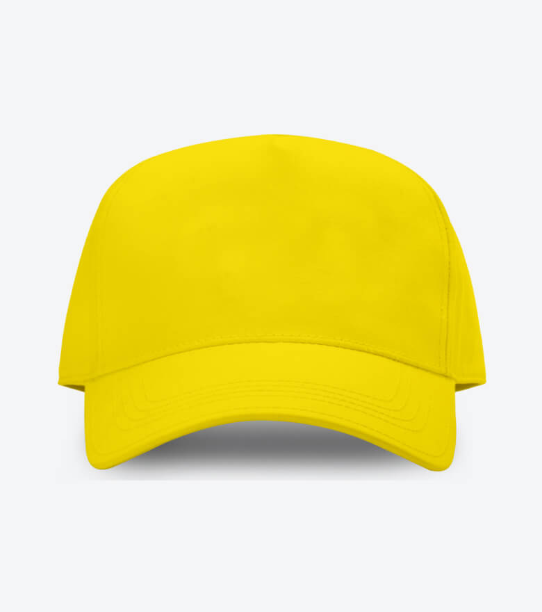
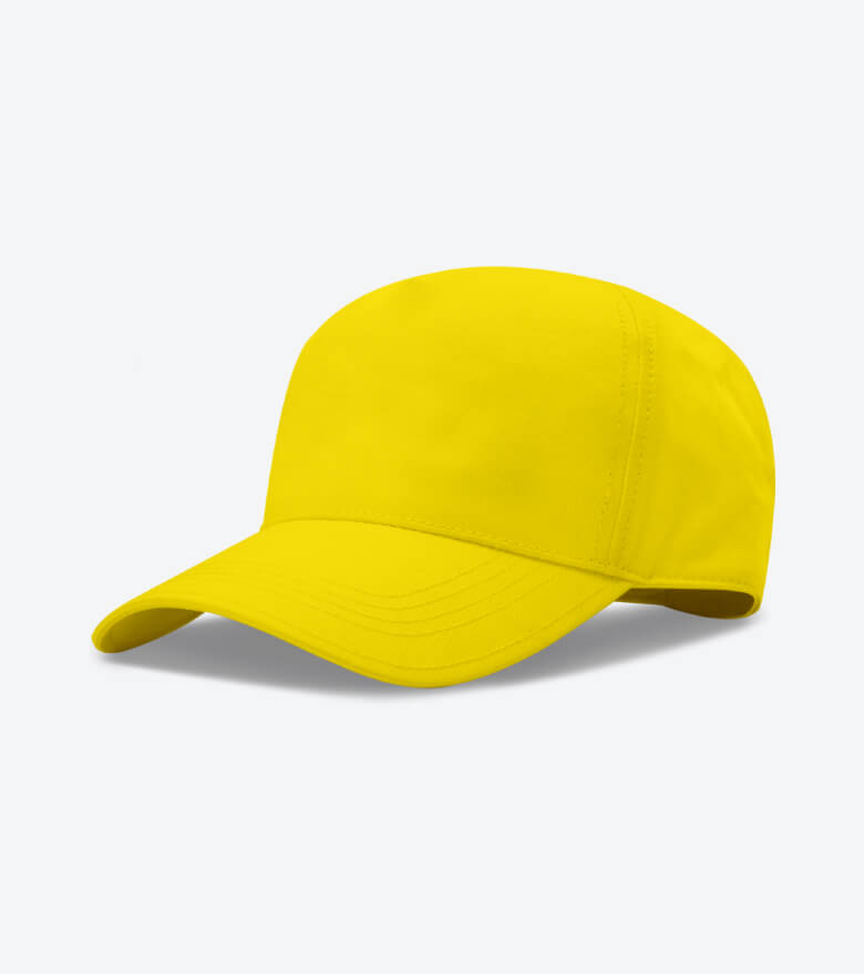
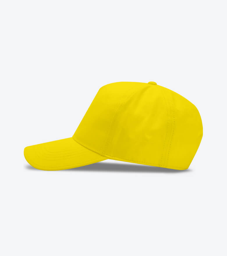
Sport cap with stitches
<!-- Product card: Carousel example -->
<div class="card card-product">
  <div class="card-product-img">

    <!-- Carousel -->
    <div class="cs-carousel cs-controls-onhover">
      <a class="cs-carousel-inner card-img-top" href="#" data-carousel-options='{
        "nav": false,
        "controlsText": [
          "<i class='cxi-angle-left'></i>",
          "<i class='cxi-angle-right'></i>"
        ]
      }'>

        <!-- Carousel items -->
        <div><img src="path-to-image" class="card-img-top" alt="Product image"></div>
        <div><img src="path-to-image" class="card-img-top" alt="Product image"></div>
        <div><img src="path-to-image" class="card-img-top" alt="Product image"></div>
      </a>
    </div>
    <div class="card-product-widgets-top">
      <div class="star-rating ml-auto">
        <i class="sr-star cxi-star-filled active"></i>
        <i class="sr-star cxi-star-filled active"></i>
        <i class="sr-star cxi-star-filled active"></i>
        <i class="sr-star cxi-star-filled"></i>
        <i class="sr-star cxi-star"></i>
      </div>
    </div>
    <div class="card-product-widgets-bottom">
      <a class="btn-wishlist active ml-auto" href="#" data-toggle="tooltip" data-placement="left" title="Remove from wishlist"></a>
    </div>
  </div>
  <div class="card-body pb-2">
    <h3 class="card-product-title text-truncate mb-2">
      <a class="nav-link" href="#">Sport cap with stitches</a>
    </h3>
    <div class="d-flex align-items-center">
      <span class="h5 d-inline-block mb-0">$40.80</span>
    </div>
  </div>
  <div class="card-footer">
    <div class="d-flex align-items-center mb-2 pb-1">
      <div class="mt-n2">
        <div class="custom-control cs-custom-size-option cs-custom-size-option-sm custom-control-inline">
          <input class="custom-control-input" type="radio" name="size" id="xl" checked>
          <label class="cs-custom-option-label" for="xl">XL</label>
        </div>
        <div class="custom-control cs-custom-size-option cs-custom-size-option-sm custom-control-inline">
          <input class="custom-control-input" type="radio" name="size" id="l">
          <label class="cs-custom-option-label" for="l">L</label>
        </div>
        <div class="custom-control cs-custom-size-option cs-custom-size-option-sm custom-control-inline">
          <input class="custom-control-input" type="radio" name="size" id="m">
          <label class="cs-custom-option-label" for="m">M</label>
        </div>
        <div class="custom-control cs-custom-size-option cs-custom-size-option-sm custom-control-inline">
          <input class="custom-control-input" type="radio" name="size" id="s">
          <label class="cs-custom-option-label" for="s">S</label>
        </div>
        <div class="custom-control cs-custom-size-option cs-custom-size-option-sm custom-control-inline">
          <input class="custom-control-input" type="radio" name="size" id="xs">
          <label class="cs-custom-option-label" for="xs">XS</label>
        </div>
      </div>
      <div class="ml-auto">
        <div class="custom-control cs-custom-color-option cs-custom-color-option-sm custom-control-inline">
          <input class="custom-control-input" type="radio" name="color" id="blue" value="Blue" checked>
          <label class="cs-custom-option-label" for="blue">
            <span class="cs-color-swatch" style="background-color: #6a9bf4;"></span>
          </label>
        </div>
        <div class="custom-control cs-custom-color-option cs-custom-color-option-sm custom-control-inline">
          <input class="custom-control-input" type="radio" name="color" id="orange" value="Orange">
          <label class="cs-custom-option-label" for="orange">
            <span class="cs-color-swatch" style="background-color: #ff9d50;"></span>
          </label>
        </div>
        <div class="custom-control cs-custom-color-option cs-custom-color-option-sm custom-control-inline">
          <input class="custom-control-input" type="radio" name="color" id="green" value="Green">
          <label class="cs-custom-option-label" for="green">
            <span class="cs-color-swatch" style="background-color: #16c995;"></span>
          </label>
        </div>
      </div>
    </div>
    <button type="button" class="btn btn-primary btn-block">
      <i class="cxi-cart align-middle mt-n1 mr-2"></i>
      Add to cart
    </button>
  </div>
</div>
Product cards: Carousel
Make sure to link to Tiny Slider css and js files in your document: vendor/tiny-slider/dist/tiny-slider.css and vendor/tiny-slider/dist/min/tiny-slider.js. Use this page as a reference.
Shirt with insertion lace trims
Sport cap with stitches
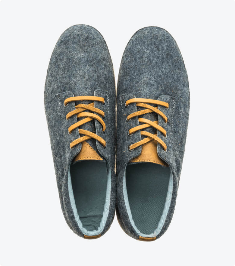
Men fashion gray shoes
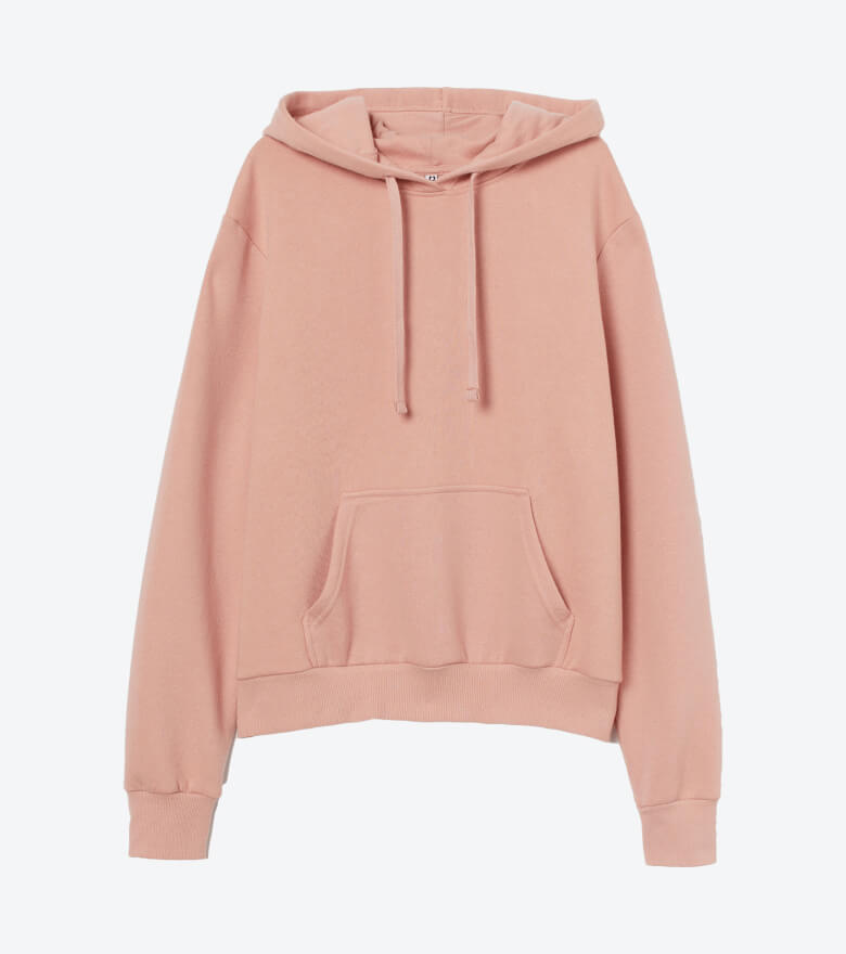
Basic hooded sweatshirt in pink
<!-- Product cards: Carousel -->
<div class="cs-carousel cs-controls-outside">
  <div class="cs-carousel-inner" data-carousel-options='{
    "nav": false,
    "responsive": {
      "0": {
        "items":1,
        "gutter": 16
      },
      "500": {
        "items":2,
        "gutter": 18
      },
      "768": {
        "items":3,
        "gutter": 18
      },
      "1200": {
        "items": 3,
        "gutter": 24
      }
    }
  }'>

    <!-- Carousel item -->
    <div>
      <div class="card card-product">
        <div class="card-product-img">
          <a class="card-img-top" href="#">
            <img src="path-to-image" alt="Product image">
          </a>
          <div class="card-product-widgets-top">
            <span class="badge product-badge badge-danger">-50%</span>
            <div class="star-rating">
              <i class="sr-star cxi-star-filled active"></i>
              <i class="sr-star cxi-star-filled active"></i>
              <i class="sr-star cxi-star-filled active"></i>
              <i class="sr-star cxi-star-filled active"></i>
              <i class="sr-star cxi-star"></i>
            </div>
          </div>
          <div class="card-product-widgets-bottom">
            <a class="btn-wishlist ml-auto" href="#" data-toggle="tooltip" data-placement="left" title="Add to wishlist"></a>
          </div>
        </div>
        <div class="card-body">
          <h3 class="card-product-title text-truncate mb-2">
            <a class="nav-link" href="#">Shirt with insertion lace trims</a>
          </h3>
          <div class="d-flex align-items-center">
            <span class="h5 d-inline-block mb-0 text-danger">$20.40</span>
            <del class="d-inline-block ml-2 pl-1 text-muted">$40.80</del>
          </div>
        </div>
      </div>
    </div>

    <!-- Carousel item -->
    <div>
      <div class="card card-product">
        <div class="card-product-img">
          <a class="card-img-top" href="#">
            <img src="path-to-image" alt="Product image">
          </a>
          <div class="card-product-widgets-top">
            <div class="ml-auto star-rating">
              <i class="sr-star cxi-star-filled active"></i>
              <i class="sr-star cxi-star-filled active"></i>
              <i class="sr-star cxi-star-filled active"></i>
              <i class="sr-star cxi-star"></i>
              <i class="sr-star cxi-star"></i>
            </div>
          </div>
          <div class="card-product-widgets-bottom">
            <a class="btn-wishlist ml-auto" href="#" data-toggle="tooltip" data-placement="left" title="Add to wishlist"></a>
          </div>
        </div>
        <div class="card-body">
          <h3 class="card-product-title text-truncate mb-2">
            <a class="nav-link" href="#">Sport cap with stitches</a>
          </h3>
          <div class="d-flex align-items-center">
            <span class="h5 d-inline-block mb-0">$40.80</span>
          </div>
        </div>
      </div>
    </div>

    <!-- Carousel item... -->
    <div>
      <div class="card card-product">
        ...
      </div>
    </div>

    <!-- Add as many items as you need -->
  </div>
</div>
Category card: Style 1

<!-- Category card: Style 1 -->
<a class="d-block cs-image-scale cs-heading-highlight text-center" href="#">
  <div class="cs-image-inner mb-3 rounded">
    <img src="path-to-image" alt="Category image">
  </div>
  <h3 class="h5 mb-3">Women’s</h3>
</a>
Category card: Style 2

<!-- Category card: Style 2 -->
<a class="d-block cs-image-scale cs-heading-highlight text-center" href="#">
  <div class="cs-image-inner mb-4 rounded-circle">
    <img src="path-to-image" alt="Category image">
  </div>
  <h3 class="h5 mb-3">Jackets</h3>
</a>
Product gallery
Make sure to link to Tiny Slider and Light Gallery css and js files in your document:
- vendor/tiny-slider/dist/tiny-slider.css
- vendor/tiny-slider/dist/min/tiny-slider.js
- vendor/lightgallery.js/dist/css/lightgallery.min.css
- vendor/lightgallery.js/dist/js/lightgallery.min.js
If you need extra features like zooming, fullscreen view or video you need to include additional plugins:
- vendor/lg-fullscreen.js/dist/lg-fullscreen.min.js
- vendor/lg-zoom.js/dist/lg-zoom.min.js
- vendor/lg-video.js/dist/lg-video.min.js
Use this page as a reference.
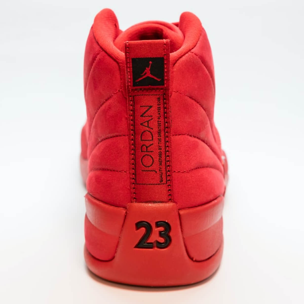
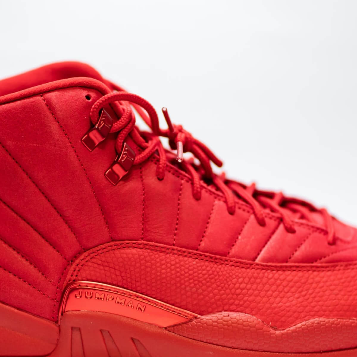
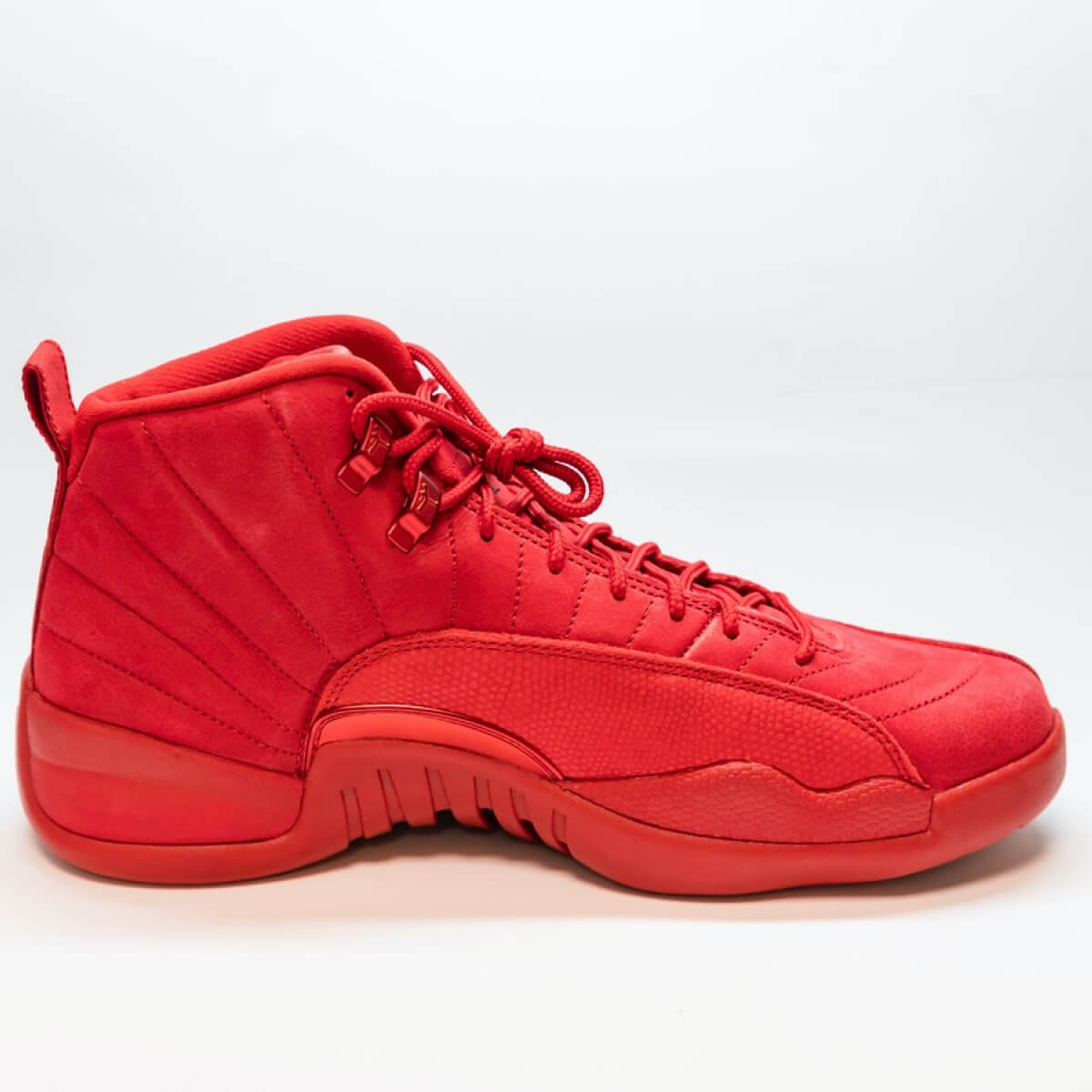
<!-- Product gallery -->
<div class="cs-carousel cs-gallery cs-product-gallery">
  <div class="cs-carousel-inner" data-carousel-options='{
    "gutter": 15,
    "navContainer": "#cs-thumbnails",
    "navAsThumbnails": true
  }'>

    <!-- Product gallery item -->
    <a class="cs-gallery-item" href="path-to-large-image" data-sub-html='<h6 class="text-light">Gallery image caption #1</h6>'>
      <img class="rounded" src="path-to-small-image" alt="Carousel image">
      <span class="cs-gallery-caption">Gallery image caption #1</span>
    </a>

    <!-- Product gallery item -->
    <a class="cs-gallery-item" href="path-to-large-image" data-sub-html='<h6 class="text-light">Gallery image caption #2</h6>'>
      <img class="rounded" src="path-to-small-image" alt="Carousel image">
      <span class="cs-gallery-caption">Gallery image caption #2</span>
    </a>

    <!-- Product gallery item -->
    <a class="cs-gallery-item video-item" href="link-to-youtube/vimeo" data-sub-html='<h6 class="text-light">Gallery image caption #3</h6>'>
      <img class="rounded" src="path-to-small-image" alt="Carousel image">
      <span class="cs-gallery-caption">Gallery image caption #3</span>
    </a>
  </div>

  <!-- Product gallery thumbnails -->
  <div class="cs-thumbnails" id="cs-thumbnails">
    <button type="button" data-nav="0">
      <img src="path-to-thumbnail" alt="Thumbnail">
    </button>
    <button type="button" data-nav="1">
      <img src="path-to-thumbnail" alt="Thumbnail">
    </button>
    <button type="button" data-nav="2" class="video-indicator">
      <img src="path-to-thumbnail" alt="Thumbnail">
    </button>
  </div>
</div>
Promo banner
Limited time offer
<!-- Promo banner -->
<div class="py-5 px-md-5 px-4 bg-size-cover bg-position-center-y" style="background-image: url(path-to-background-image);">
  <div class="mt-md-3 mb-5 pb-5 p-md-2" style="max-width: 14rem;">
    <h3 class="mb-2 pb-1 font-size-sm text-uppercase">Summer Collections</h3>
    <h2 class="pb-3">Sale Up to 70%</h2>
    <a class="btn btn-outline-primary mb-5" href="#">Explore new prices</a>
  </div>
  <div class="mb-md-3 pt-5 p-md-2">
    <h3 class="mb-2 pb-1 font-size-sm text-uppercase">Limited time offer</h3>
    <div class="cs-countdown h3 mb-0" data-countdown="10/01/2022 07:00:00 PM">
      <div class="cs-countdown-days mb-0">
        <span class="cs-countdown-value">0</span>
        <span class="cs-countdown-label mt-1 font-size-sm text-body">Days</span>
      </div>
      <div class="cs-countdown-hours mb-0">
        <span class="cs-countdown-value">0</span>
        <span class="cs-countdown-label mt-1 font-size-sm text-body">Hours</span>
      </div>
      <div class="cs-countdown-minutes mb-0">
        <span class="cs-countdown-value">0</span>
        <span class="cs-countdown-label mt-1 font-size-sm text-body">Mins</span>
      </div>
      <div class="cs-countdown-seconds mb-0">
        <span class="cs-countdown-value">0</span>
        <span class="cs-countdown-label mt-1 font-size-sm text-body">Secs</span>
      </div>
    </div>
  </div>
</div>
Active filters
<!-- Active filters -->
<a class="active-filter" href="#">Active filter</a>
Product review
Devon Lane
July 15, 2020Annette Black
1 day ago@Devon LaneEgestas fermentum natoque sollicitudin mauris. Facilisis praesent urna sed rhoncus quis pharetra pellentesque erat sagittis.
<!-- Product review -->
<div class="mb-4 pb-4 border-bottom">
  <div class="row">
    <div class="col-md-3 col-sm-4 mb-sm-0 mb-3">
      <h3 class="mb-2 font-size-lg">Annette Black</h3>
      <span class="d-block mb-3 font-size-sm text-muted">1 day ago</span>
      <div class="mt-n1 star-rating">
        <i class="sr-star cxi-star-filled active"></i>
        <i class="sr-star cxi-star-filled active"></i>
        <i class="sr-star cxi-star-filled active"></i>
        <i class="sr-star cxi-star-filled active"></i>
        <i class="sr-star cxi-star"></i>
      </div>
    </div>
    <div class="col">
      <p class="mb-3">
        <a class="mr-1 font-weight-bold text-decoration-none" href="#">@Devon Lane</a>
        Egestas fermentum natoque sollicitudin mauris. Facilisis praesent urna sed rhoncus quis pharetra pellentesque erat sagittis.
      </p>
      <div class="d-flex justify-content-between">
        <a class="nav-link p-0 font-size-sm" href="#">
          <i class="cxi-chat mr-2 font-size-base align-middle mt-n1"></i>
          Reply
        </a>
        <div class="d-flex">
          <a class="nav-link mr-3 p-0 font-size-sm" href="#">
            <i class="cxi-like mr-2 font-size-base align-middle mt-n1 text-success"></i>
            2
          </a>
          <a class="nav-link p-0 font-size-sm" href="#">
            <i class="cxi-dislike mr-2 font-size-base align-middle mt-n1 text-danger"></i>
            1
          </a>
        </div>
      </div>
    </div>
  </div>
</div>